Case Study
Virginia’s Crossroads - AMA EMMA Award Winning Regional Tourism RebrandChallenge
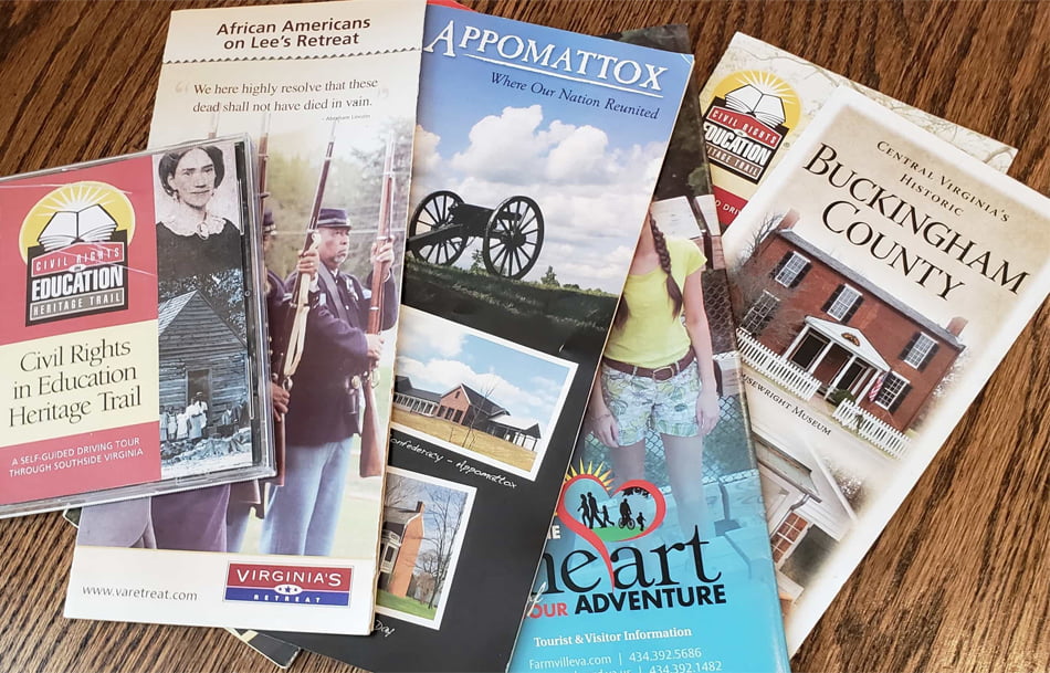
Those familiar with the area knew it primarily for its civil war heritage. Regional tourism officials recognized the need to do something different to attract younger and more culturally-minded travelers. They needed to more aggressively compete with their well-funded and better-recognized regional neighbors on all sides.
Solution
The logo itself was inspired by the traditional “blazes” that hikers use to navigate their way through the woods. It is designed to portray a sense of adventure, curiosity, and wonder. The new logo is decidedly younger, edgier, and more thought-provoking than its predecessor, but Eddy Alexander carefully balanced that disruptive tendency with a focus on ensuring a warm, welcoming, and authentic reflection of the region that didn’t conflict with historical representations.
The color used, the typography chosen, and the blaze-mark itself work together to represent a greater diversity of assets and engage a younger and more sophisticated audience, two essential criteria critical to the region’s long-term economic success.
Execution
By building on the region’s reputation for history, the design team used the new logo and brand concept to continuously pair the expected visuals with less recognized assets to both educate and challenge future visitors to take a closer look at the region. The logo pays homage to the traditional using a block letter “V” to represent the Commonwealth and then overlays a bright and modern trail blaze mark.
This juxtaposition of styles creates an “X” crossing that signifies the literal and social crossroads embodied by the region’s historic context. The design and the name work together to represent and pay tribute to the rebellious current that underpins Virginia’s Crossroads’ long and storied regional history.

Results
“I have been involved with this organization since 2006 working with several marketing consultants and designers trying to develop various aspects of a targeted marketing approach to our region. Eddy Communication stands out head and shoulders above the other organizations I have worked with. They listened and delivered – when they presented solutions to us, we knew they “got it”.”